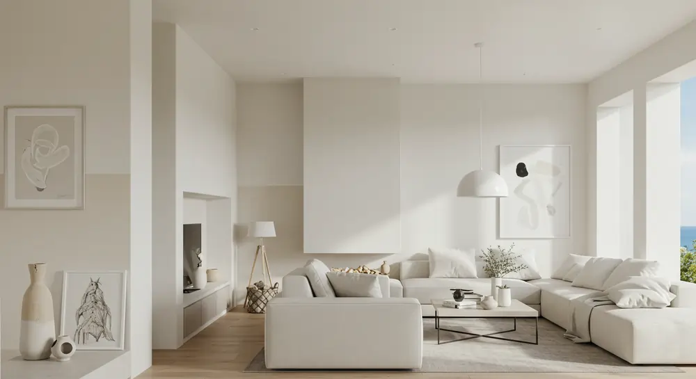
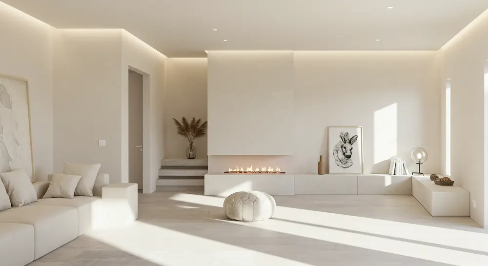
When it comes to painting your home, few choices are as inherently sophisticated and endlessly versatile as off-white paint colors. These subtle, warm hues bridge the gap between stark bright white and richer neutrals, offering a variety of shades that adapt to any space, style, or mood. Whether you’re refreshing a kitchen, reimagining a living room, or adding depth to a bedroom, off-white paints bring comfort, sophistication, and a touch of natural elegance. Let’s dive into why these tinted whites are dominating interior design—and how to choose the best off-white paint colors for your next project.
Why Off-White? The Magic of Subtle Nuances
Pure white paint might seem like a safe bet, but it can easily feel sterile or cold, especially in rooms with limited light. Enter off-white paint colors: they retain the clean simplicity of white paint while introducing subtle undertones of yellow, green, gray, or even red. This makes them versatile enough to complement both traditional and modern decor, adapt to changing natural light, and pair effortlessly with darker accents or soft textiles.
According to experts at Sherwin Williams, off-whites are the go-to choice for designers because they add warmth without overwhelming a room. As Benjamin Moore notes, these hues “create a sense of calm and balance,” making them ideal for walls, trim, and even ceilings.
Off-White vs. Bright White: What’s the Difference?
The key distinction lies in the undertones. While bright white paints (like Behr’s Ultra Pure White) are clean and crisp, off-whites are slightly tinted to evoke warmth or depth. For example:
- Swiss Coffee by Benjamin Moore has faint green and yellow undertones, giving it an earthy, inviting tone.
- Alabaster from Sherwin Williams leans into ivory for a delicate, creamy look.
- White Dove (another Benjamin Moore favorite) balances gray and warm notes, making it excellent for trim or cabinets.
These variations mean off-whites can make a space feel cozier, brighter, or more expansive, depending on the shade.
Read More https://ahouseinthevalley.com/the-ultimate-guide-to-sherwin-williams-agreeable-gray/
The Undertone Dilemma: How to Pick the Right Hue
Choosing an off-white isn’t just about preference—it’s about understanding how undertones interact with your room’s lighting and furnishings. Here’s a quick guide:
| Undertone | Best For | Popular Example |
|---|---|---|
| Yellow | North-facing rooms, kitchens | Benjamin Moore’s Cloud White |
| Gray | Modern living rooms, bedrooms | Sherwin Williams’ Shoji White |
| Green | Spaces with natural materials | Behr’s Swiss Coffee |
| Pink/Red | Warm, inviting entryways | Farrow & Ball’s Pointing |
Designers often recommend testing samples on your wall at different times of day. A hue that looks warm at noon might feel slightly cool under evening lamps.
Top 5 Off-White Paint Colors, According to Experts
-
Benjamin Moore White Dove
- Undertones: Soft gray and warm ivory
- Perfect For: Trim, ceilings, and cabinets. It’s a favorite off-white for its chameleon-like ability to pair with darker woods or bold art.
- Learn more
-
Sherwin Williams Alabaster
- Undertones: Creamy ivory
- Perfect For: Kitchens and bedrooms. This 2016 Color of the Year adds comfort without sacrificing sophistication.
- Explore Alabaster
-
Behr Swiss Coffee
- Undertones: Muted green and yellow
- Perfect For: Living rooms with natural light. Its earthy tone pairs beautifully with stone countertops or linen fabrics.
- Shop Swiss Coffee
-
Farrow & Ball Pointing
- Undertones: Warm stone with a slightly pink base
- Perfect For: Historic homes or traditional spaces. It’s a versatile choice that resists feeling sterile.
- Discover Pointing
-
Benjamin Moore Simply White
- Undertones: Crisp with a hint of yellow
- Perfect For: Small rooms. This 2016 Color of the Year makes spaces feel brighter and airier.
Where to Use Off-White in Your Home
- Kitchens: Try Alabaster on cabinets for a clean yet cozy look. Pair with blue backsplashes or brown wood floors.
- Living Rooms: White Dove on walls creates a neutral backdrop for art and decor. Add red or green accent pillows.
- Bedrooms: Swiss Coffee promotes comfort and pairs well with grey bedding or ivory throws.
- Trim and Ceilings: Use Benjamin Moore’s Chantilly Lace for a bright white contrast against off-white walls.
Pro Tips for Pulling Off Off-White
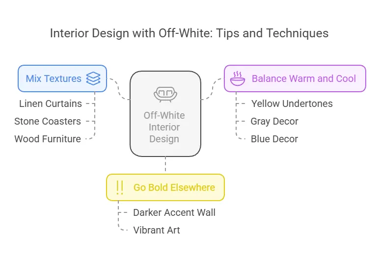
- Mix Textures: Layer linen curtains, stone coasters, and wood furniture to keep the palette dynamic.
- Balance Warm and Cool: If your wall color has yellow undertones, add gray or blue decor to avoid a “muddy” look.
- Go Bold Elsewhere: Let off-white walls shine by introducing a darker accent wall or vibrant art.
Final Thoughts: Why Off-White is Forever
With their long history in design and endless versatility, off-white paint colors are far from boring. They’re the sophisticated, subtle heroes of interior spaces—ready to adapt to your style, light, and life. Whether you choose Sherwin Williams’ buttery Alabaster or Benjamin Moore’s iconic White Dove, these hues promise a fresh, timeless feel for any room.
So grab a paint roller, shop for samples, and share your favorite off-white in the comments below! 🎨
FAQs
What exactly are off white paint colors?
Off white paint colors are white paint colors with subtle undertones that give them a softer, warmer appearance than pure white. These white with subtle nuances can range from creamy yellows to pale greys, offering a versatile and timeless option for interior and exterior painting. The collection of off white paint colors provides a sophisticated alternative to stark white, creating a more inviting and comfortable atmosphere in any space.
Why are off white paint colors considered timeless?
The timeless appeal of off white paint colors lies in their versatility and ability to complement various design styles. These white with subtle nuances work well with both traditional and modern aesthetics, making them a popular choice among homeowners and interior designers. Unlike trendy colors that may quickly go out of style, off white paint colors maintain their charm over time, allowing for easy updates to decor without the need for frequent repainting.
How do I choose the right off white paint color for my space?
Selecting the perfect off white paint color involves considering factors such as lighting, room size, and existing decor. Start by examining the undertones in your furniture and flooring. Then, test several off white paint colors on your walls to see how they appear in different lighting conditions throughout the day. It’s also helpful to consult with a professional or use color visualizer tools to make an informed decision. Remember that off white paint colors can feel like different shades depending on their surroundings, so take your time in making the final selection.
What are some popular off white paint colors from leading brands?
Some popular off white paint colors from leading brands include Benjamin Moore’s ‘White Dove,’ Sherwin-Williams’ ‘Alabaster,’ and Farrow & Ball’s ‘Pointing.’ Each item offers a warm, versatile hue that complements various decor styles. These off white paint colors are favored for their ability to create a serene and inviting atmosphere.